

Meanwhile, it is clear that O365 is a fast-growing platform and that Microsoft is adding new features and products to it on a regular basis. Along with O365’s new Admin Portal comes an additional feature, Usage Reports. The reports aim to give you insight about the usage of the different products of O365 such as Exchange, Onedrive, Skype for Business, Microsoft Teams… This can range from a periodic follow-up every month, to follow up on the activation of a recently added component such as Microsoft Teams, for example.
![]()
So this allows you to get insights into whether your users are switching from Skype for Business to Microsoft Teams, for example. Perhaps they have discovered the benefit of OneDrive and so are uploading more documents. Or are they going to share more and more documents with external people to improve collaboration with external parties. All scenarios you can identify with usage reports.
Where can I consult this?
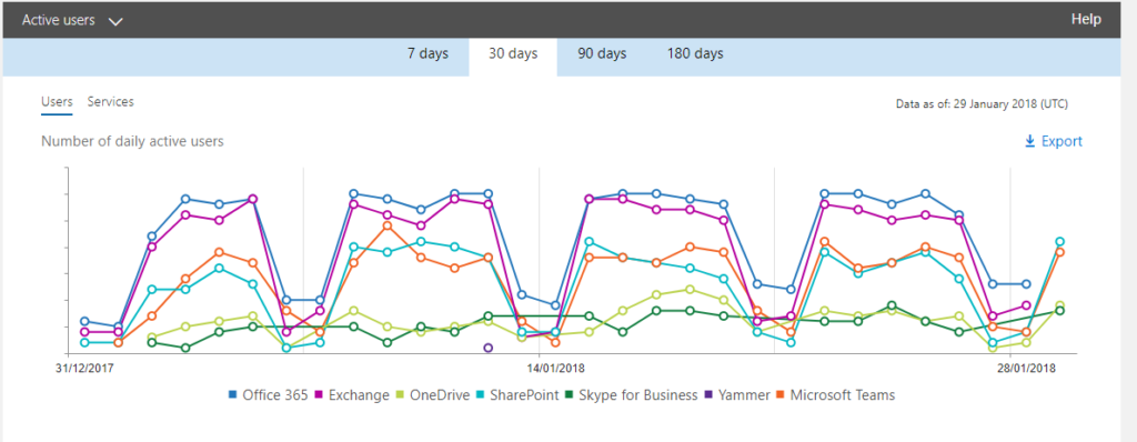
If you click on Reports on the left in the Admin Portal and then on Usage, you will immediately see an overview of the most important cases with different technologies combined.
At the top, we see user activity in Exchange, OneDrive, SharePoint, Skype for Business, Yammer and Teams. At the bottom, we see at a glance some other interesting reports:
- Email Activity (sent, received and read)
- Onedrive files (storage used)
- SharePoint files (viewed or edited, files synced, shared internally and shared externally)
- Skype for Business (peer-to-peer, organized conferences, participated-in conferences)
- Office activations (desktops, devices)
- Yammer
- Microsoft Teams activity (chat messages, channel messages)
- Office 365 Adoption (Preview) to get more information using Power BI
Each time for 7, 30, 90 or 180 days.
Detailed reports
You can find detailed reports for each technology by using the dropdown at the top left (Select a report).
Going over every report would not add value, so a brief example will suffice:
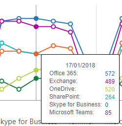
Office 365 – Active users: this graph shows by technology what the usage has been by users over a 7-day period. If you hover over the data points with your cursor, you get more detailed information about a specific day. For example, you can see that on Jan. 17, 572 people used Exchange and 85 people used Microsoft Teams.
Below the graph you can find the actual data. For the “Active users” report, this is the data per user. Should you go to the “SharePoint sites” report, of course you will not see users listed there, but specific sites.
Export options
![]() Both the charts and the tables allow you to click the export button. This allows you to download a .csv file so you can start viewing and visualizing the data in Excel. You can do this, for example, should you want to merge it with other data.
Both the charts and the tables allow you to click the export button. This allows you to download a .csv file so you can start viewing and visualizing the data in Excel. You can do this, for example, should you want to merge it with other data.
Note: it may take some time before the download starts, depending on the amount of data (number of days, number of users, number of sites,…).
Power BI
The default home screen offered by O365 already displays a great deal of information, but unfortunately enough it cannot be customized. For those customizations, we can turn to Power BI where you do have the ability to create your own personalized screens. For this, Microsoft has created an “Office 365 Adoption (Preview)” pack where you can immediately access an already more detailed screen.
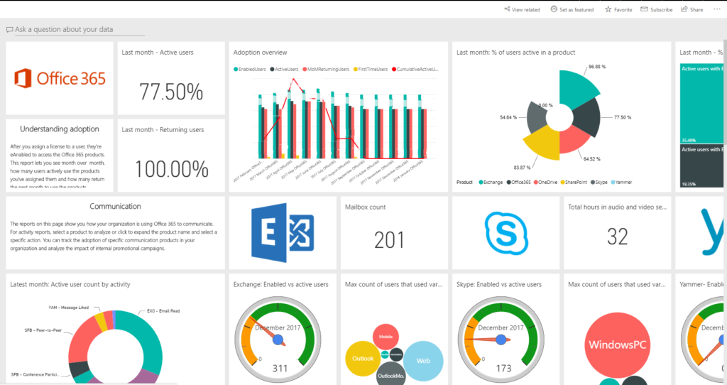
The practiced Power BI users among us can continue to fine-tune the newly created dashboard. If desired, they can start from a blank dashboard and customize it completely to their liking.
